Improve UX for login dialog
this is the initial login window:
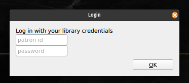
this dialog will pop up on the first run of the app. when successfully logged-in, it will cache a token that will allow the VPN to be started - for now, this token is valid for 1 day. After vpnweb#9 (closed) is done, this dialog will display only the patron number entry field if the library does not use passwords (and so phrasing should be carefully chosen to include both cases, or change to make the patron-id explicit)
some improvement ideas:
-
use the application / library logo -
improve presentation (colors? white background?, spacing / alignment ) -
improve fonts -
change phrasing -
include some help element (either tooltips or what's this pop-ups https://doc.qt.io/archives/qt-4.8/qwhatsthis.html explaining where you should find your patron id in your library card?)
if possible, i'd like to have some rough specs (wireframes ok) of this dialog.
Edited by Kali Kaneko